
 A couple of weeks ago, I shared with you the saga of a lost box, inside which were several copies of the Chinese edition of The Sisters. Alas, the box has yet to arrive, but my agent’s kindly assistant, Wendi, sent me the copy I had suggested she keep for herself. I wanted Wendi to have a copy because she’s the only person I know at this time in my life who can actually read the translation. It was Wendi who told me, when the books arrived in my agent’s office, that the title translates literally from the Chinese as Older Sister’s Tears.
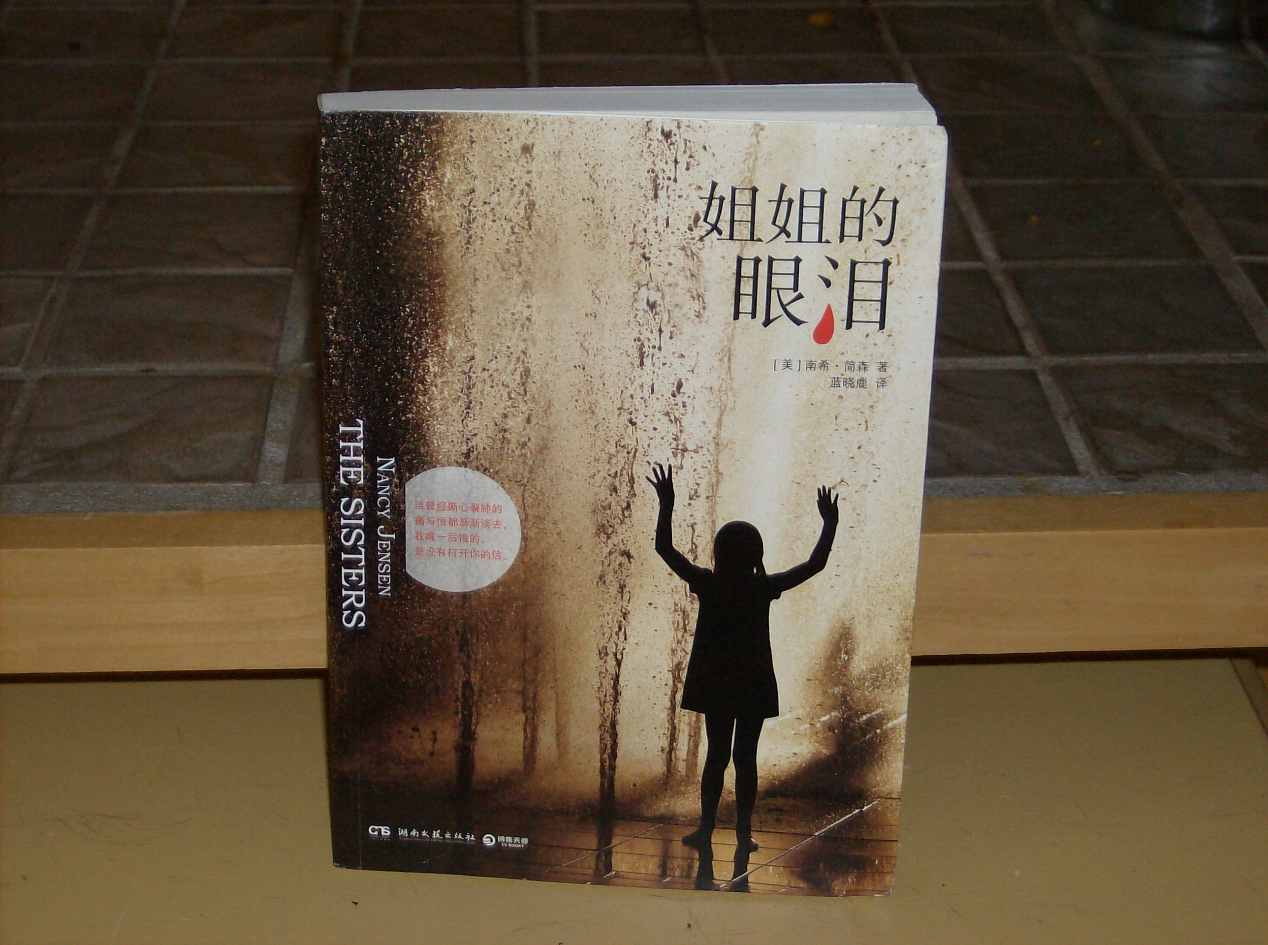
Can you see the teardrop in the title line?
My agent had enticed my imagination by saying to me that the Chinese cover “couldn’t be more different” from the American cover–and, as you can see, she was right. In these last five weeks, my mind has splashed dozens of images up for my inner eye, but nothing like this.
Nothing so compelling and wonderful as this.
I’ve been interested in–and frankly awed by–the art of translation since I studied French in college, when I came to realize that translation was not just a matter of words, or even of nuance, but also a matter of ideas and of how the ideas themselves are translated through a particular cultural lens. And so ever since The Sisters was sold to Booky, the Chinese publisher, I’ve wondered how the story, how my women’s choices, would be understood by the translator, a person as inextricably and unconsciously steeped in his or her native culture as I am in mine.
A different sort of translation that fascinates me is the translation of one art form into another–in this case, a written story into a visual image, one that bears the burden of communicating something essential about the novel. That’s true even in the original language, and I find that when people ask me how I chose the cover for the American publication of The Sisters, I first have to correct them by saying I didn’t choose it at all. Instead, I was the blessed beneficiary of a designer at St. Martin’s Press who grasped an essential theme of the story–that something precious and fragile has been broken–and expressed that theme in the doubled image of broken teacups, two of a set, not mirroring each other but rather one behind the other, yet still broken in the same way.
Now I’m enjoying wondering about what the Chinese designer picked up, what that person understood from reading the book or perhaps from listening to the translator or the editor. Was the artist thinking of Mabel, kept away from Bertie by a wall of water–which could be infused with fire or light–something she can almost see through but can’t pass through? Did the designer recognize there’s a metaphorical motif of water that links all the three elder sisters of the story together? For Mabel, there is the river, where she let herself be re-baptized so fearful Bertie wouldn’t have to plunge beneath the water alone. For Alma, there is the flood that alters entirely the course of her life. For Lynn, there is her near-drowning, which, as with the other incidents, links water to the losses the elder sisters can’t ever quite overcome.

